Case Study · 01
PNC Funding Desk
A real-time liquidity operations platform that replaced a fragmented, manual process for PNC's Funding Desk — giving the team self-service, near real-time visibility into the data driving their daily decisions.
Overview
The challenge
PNC's Funding Desk is responsible for managing the bank's daily liquidity — including maintaining the required Federal Reserve balances on PNC's checking accounts. Getting that balance wrong, even temporarily, carries real regulatory and financial consequences.
I was brought in as the sole UX/UI designer to design an end-to-end internal platform that would replace a fragmented, manual process and give the Funding Desk real-time visibility into the data driving their decisions.
The result was the Funding Desk System — a self-service, near real-time research and reporting platform built around the team's daily workflow.
Role
- Sole UX/UI Designer
Worked with
- Software architect
- Backend developers
- Funding desk stakeholders
Engagement
Company
PNC Financial Services
Product
Funding Desk System (internal)
Type
Internal tooling · Enterprise · Financial operations
What I owned
- End-to-end UX & UI
- Information architecture
- 10 platform modules
- Configurable dashboard system
- Interactive prototypes
A Day in the Life
Before the platform
To understand the problem, it helps to understand what the Funding Desk's day actually looked like before the platform existed.
Every morning began with manual data gathering — pulling transaction data from wire systems, ACH platforms, and multiple banking portals, each updating on its own schedule. The team tracked three key figures: Opening Balance, Current Balance, and Net Balance (a calculated field) — but since none of this was centralized, they were constantly reconciling across spreadsheets and email reports.
As the day progressed, payments continued to post. The team adjusted estimates continuously, resolving discrepancies over calls and email. When uncertainty arose about whether an account held sufficient funds, escalation and short-term borrowing decisions had to be made quickly — often without clean data to support them.
Data sources
Wire systems, ACH platforms, and multiple banking portals — each on its own refresh schedule.
No single source of truth for the Fed account balance.
Tracked daily
Opening Balance · Current Balance · Net Balance (calculated).
Reconciled by hand across spreadsheets and email.
Refresh & alerts
Data refreshed every 15 minutes, delivered by email.
No automated alerts — if a threshold broke and no one was watching, no one knew.
The Problem
Three compounding issues
Three issues compounded to define the core UX problem — each one making the others harder to manage.
Fragmented data sources
No single view of the Fed account balance. Analysts pieced together a picture from multiple portals, files, and email reports.
Delayed, manual reporting
A 15-minute email cadence meant decisions were always made on stale data. Any discrepancy required investigation before action.
No safety net
Without threshold alerts or automated monitoring, the team carried the cognitive load of constant vigilance — where human error had regulatory consequences.
The goal
Replace this daily cycle of uncertainty with a platform that automated ingestion, surfaced data in near real-time, and gave analysts the tools to act — not just observe.
The Platform
One platform, built around the workflow
Rather than a single screen, the solution was a multi-module platform built around the Funding Desk's daily workflow. The modules follow the data lifecycle — monitor → ingest → govern → process → deliver — and map one-to-one to the screens below.
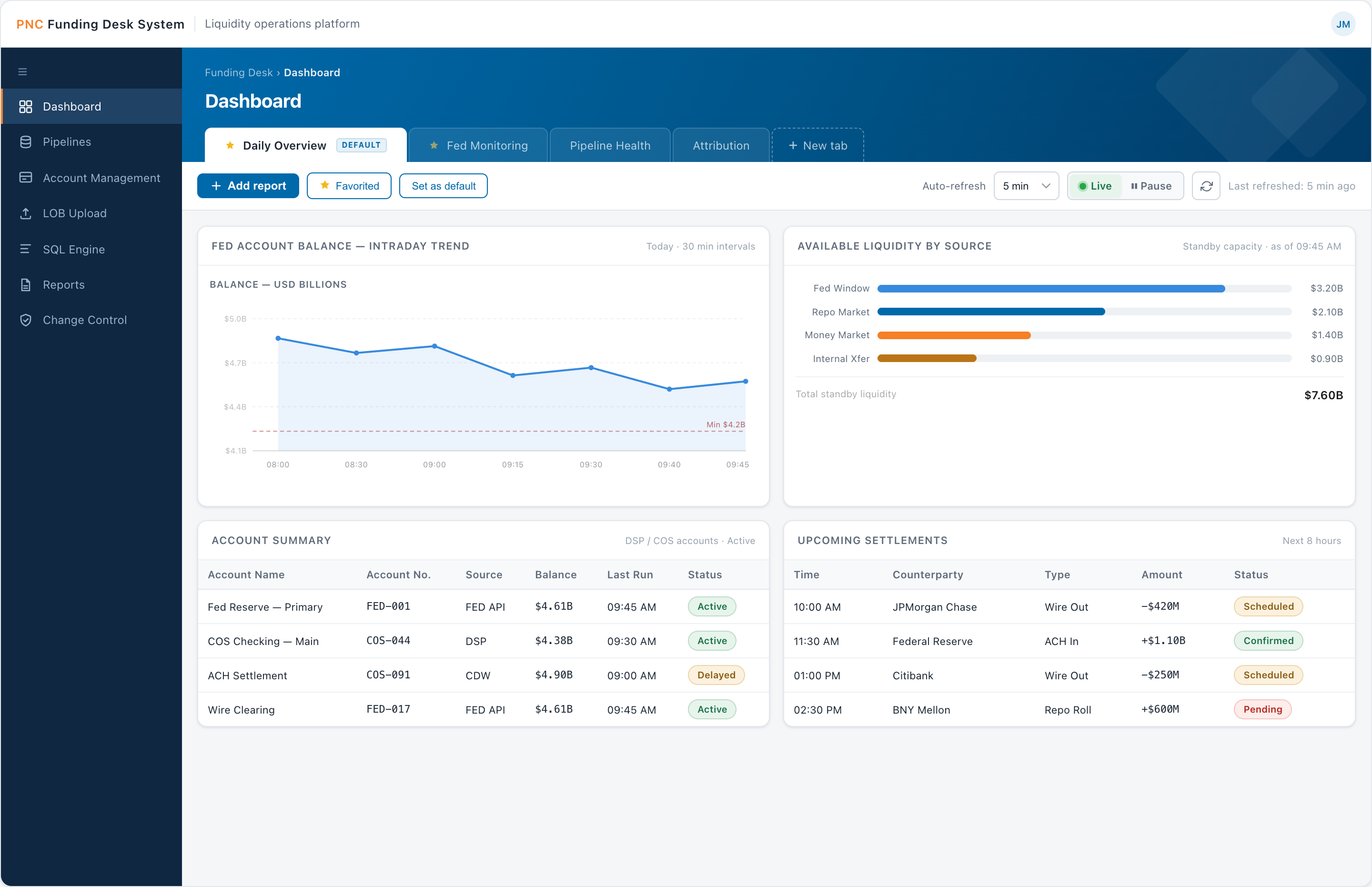
01 Monitor
Dashboard — Daily Overview
The team's home base: real-time Fed balance, threshold alerts, intraday activity, and pipeline health in one glanceable view.
- In-hero view tabs — Daily overview, Fed monitoring, Pipeline health, Attribution
- Metric cards with deltas; intraday activity by source; alert list with severity
- Account summary and pipeline run status, with a visible refresh cadence
Why: replaces the old 15-minute email cadence with a live, glanceable picture.
02 Ingest
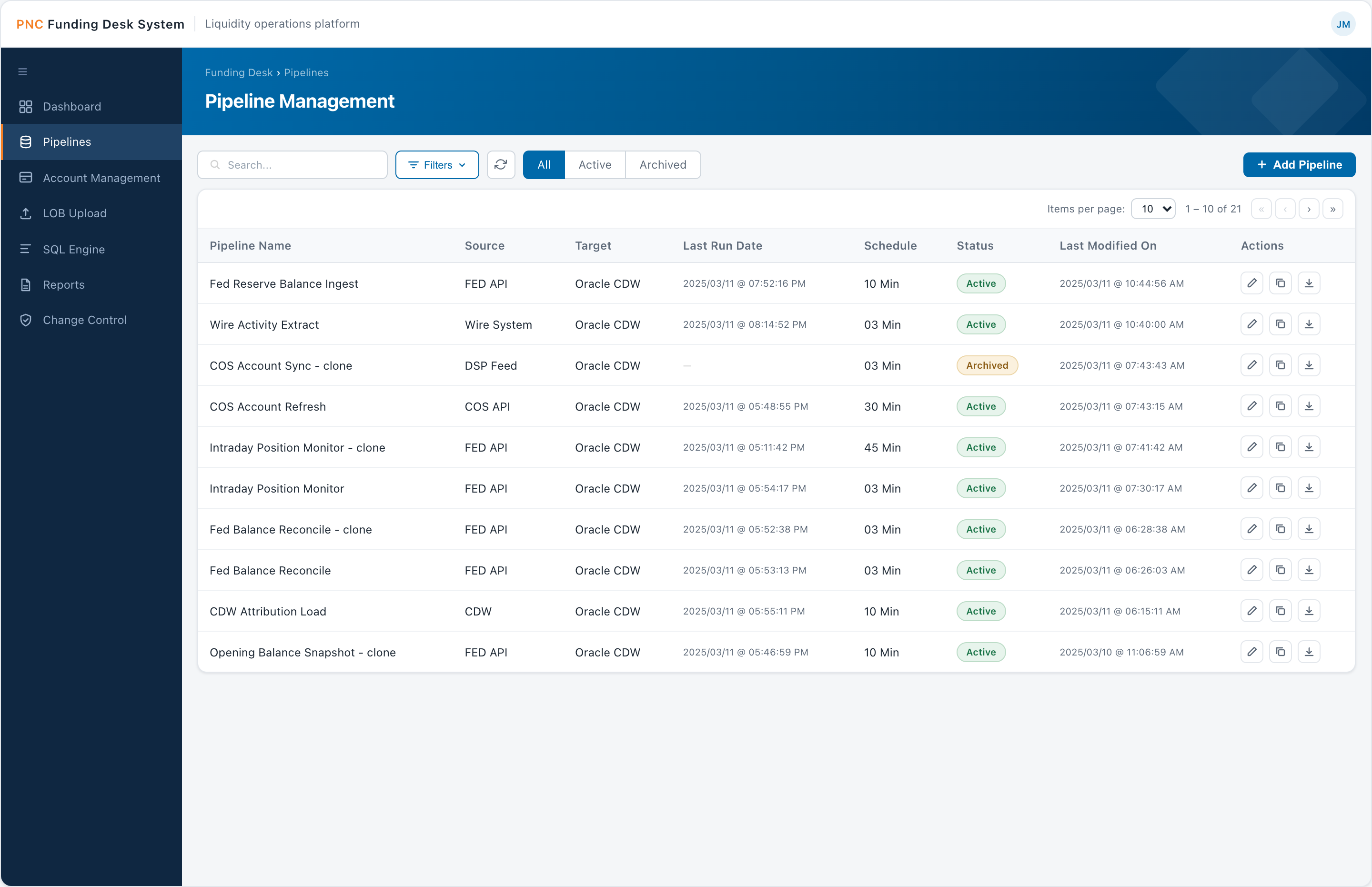
Pipeline Management
Configuration-driven ingestion from APIs, files, and databases — set up and cloned through the UI, with no engineering dependency for routine changes.
- Searchable, status-filtered table (All · Active · Archived) with per-row edit / clone / export
- Source (FED API, DSP Feed) → target (Oracle CDW)
- Configurable schedules, from 3 to 45 minutes
Why: moves routine pipeline changes from an engineering ticket to a self-service action.
03 Ingest
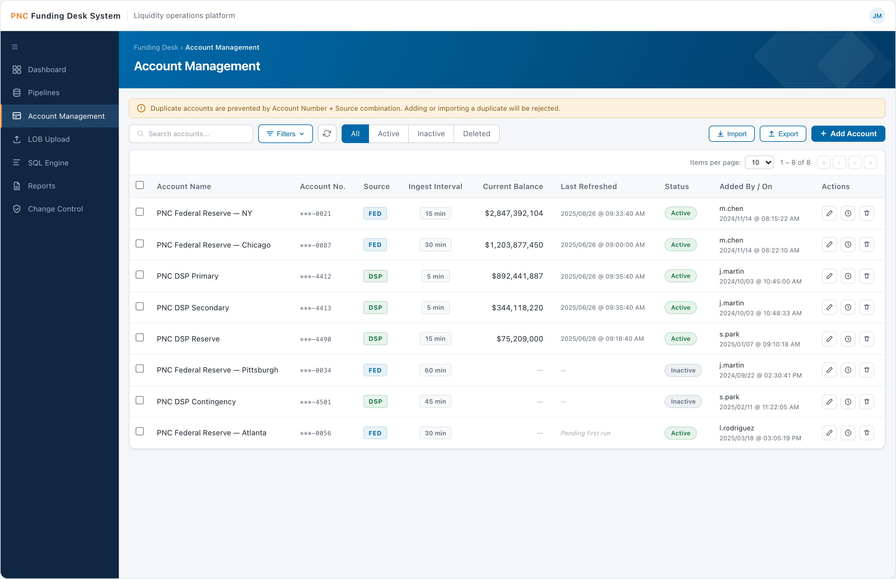
Account Management
The registry of FED and DSP accounts and how often each one's balance is ingested.
- Source badges (FED / DSP), interval pills (5–60 min), masked account numbers
- Duplicate prevention by Account Number + Source; Excel import / export
- Soft-delete with audit trail; status filters (All · Active · Inactive · Deleted)
Why: control and accountability over the account list without hard-deleting regulated data.
04 Govern
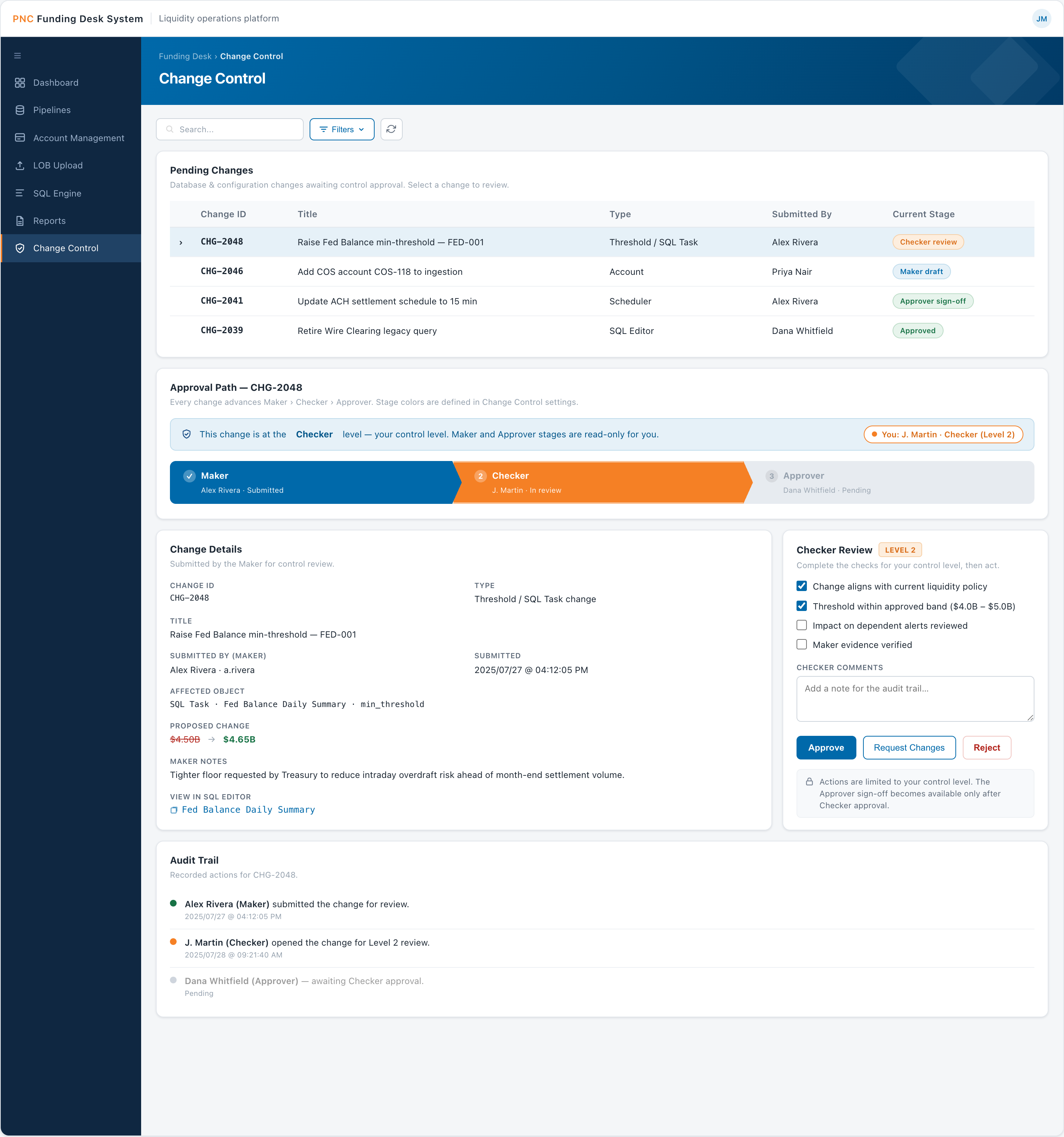
Change Control
A Maker → Checker → Approver workflow gating every database and configuration change — the platform's governance layer.
- Approval chevrons with per-stage role colors and status
- Role-gated actions — only your level is actionable, others are read-only
- Validation checklist, comments, and a full audit trail
Why: turns high-stakes changes into reviewable, auditable events instead of silent edits.
05 Govern
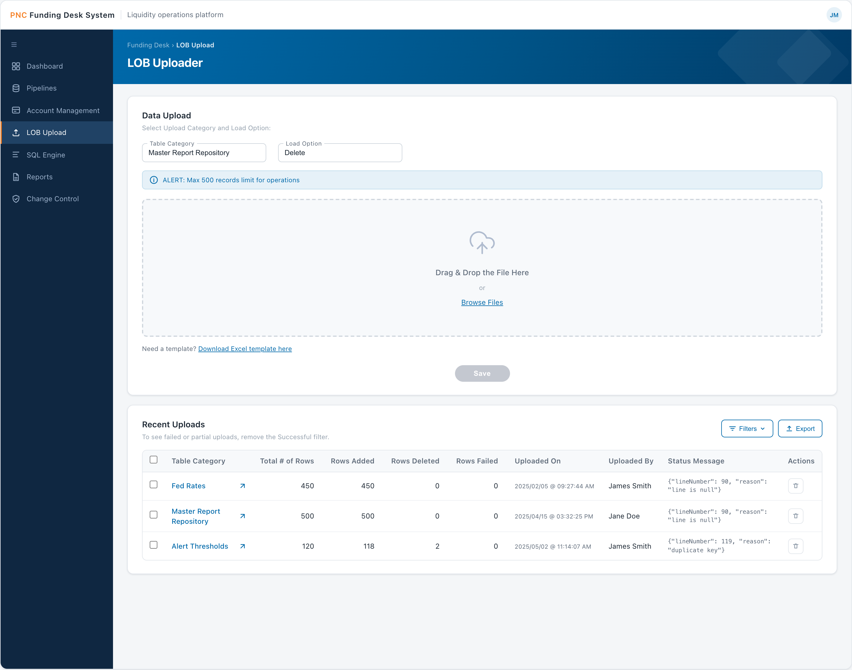
LOB Bulk Uploader
On-demand bulk loading of the reference and lookup tables — Fed rates, alert thresholds, event calendars — that the rest of the platform reads from.
- Table-category and load-option selectors (Delete / Insert / Update / Upsert)
- Drag-and-drop zone, Excel template, 500-record batch cap
- Recent Uploads history with line-level error reasons
Why: lets analysts maintain master data themselves, with clear error feedback.
06–09 Process
SQL Engine — the analytical core
Four cooperating screens that turn raw ingested data into delivered reports. Separating authoring, packaging, bundling, and timing lets one query power many scheduled, formatted deliveries.
-
06SQL Editor — the core
Write and run the query that defines exactly what data is needed.
-
07Task Editor
Maps that query to a target format and delivery location.
ETL Text CSV -
08Group Editor
Bundles related tasks into one packaged target format.
Excel PDF UI Email -
09Scheduling
Automates the job on a schedule so the data is delivered on time.
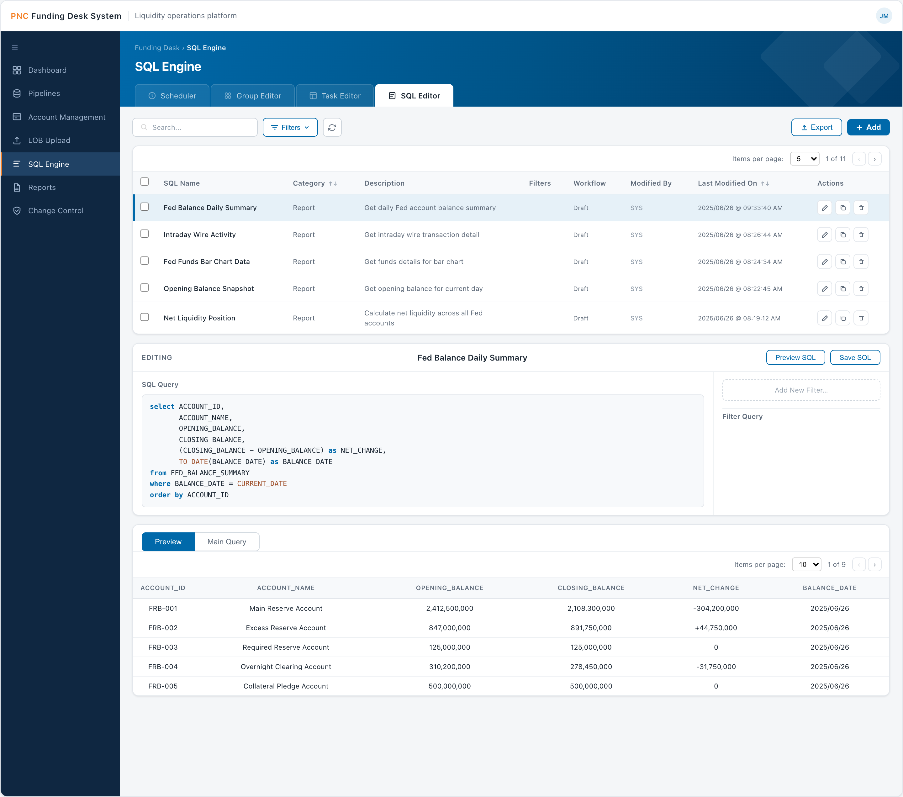
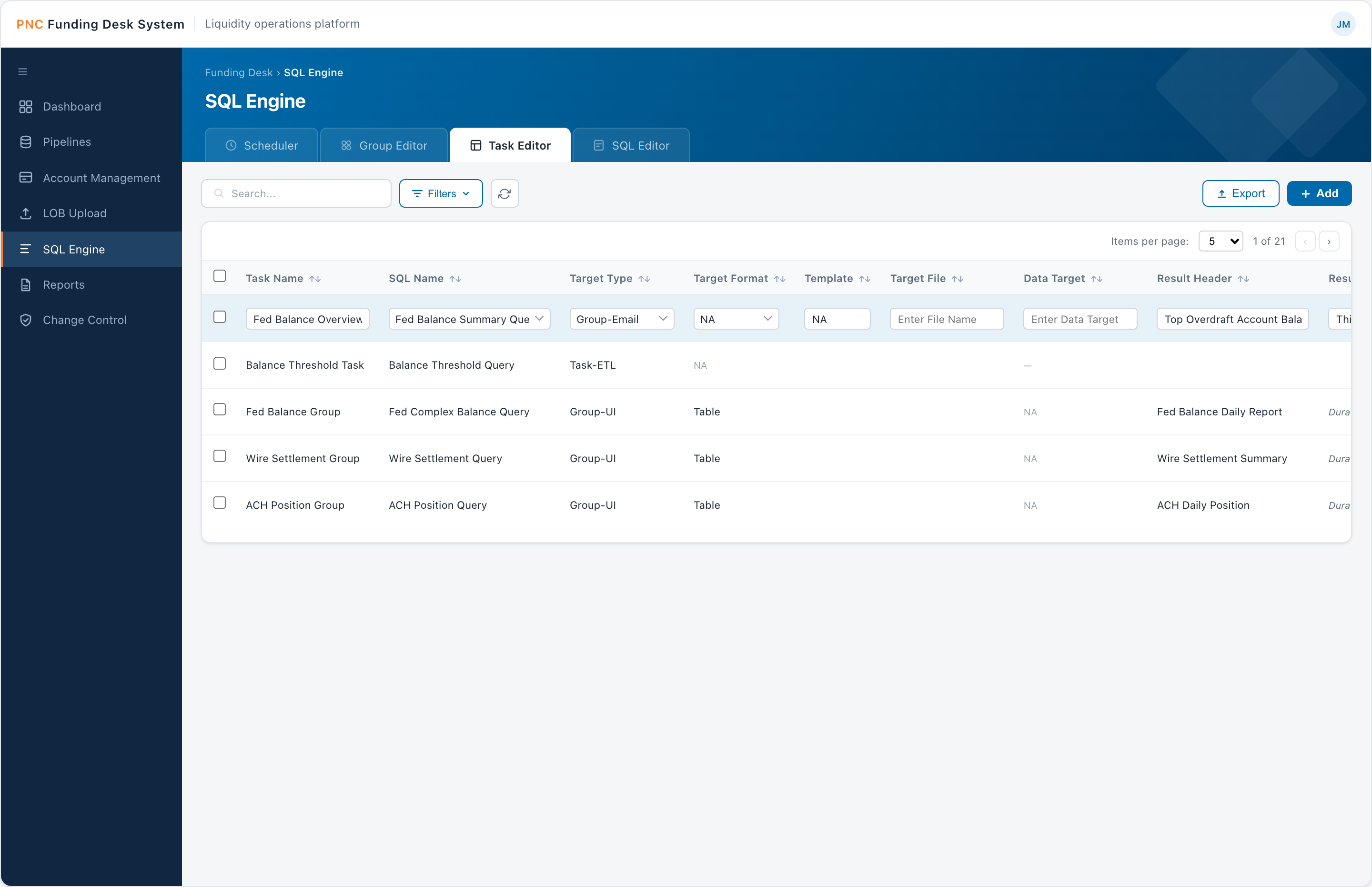
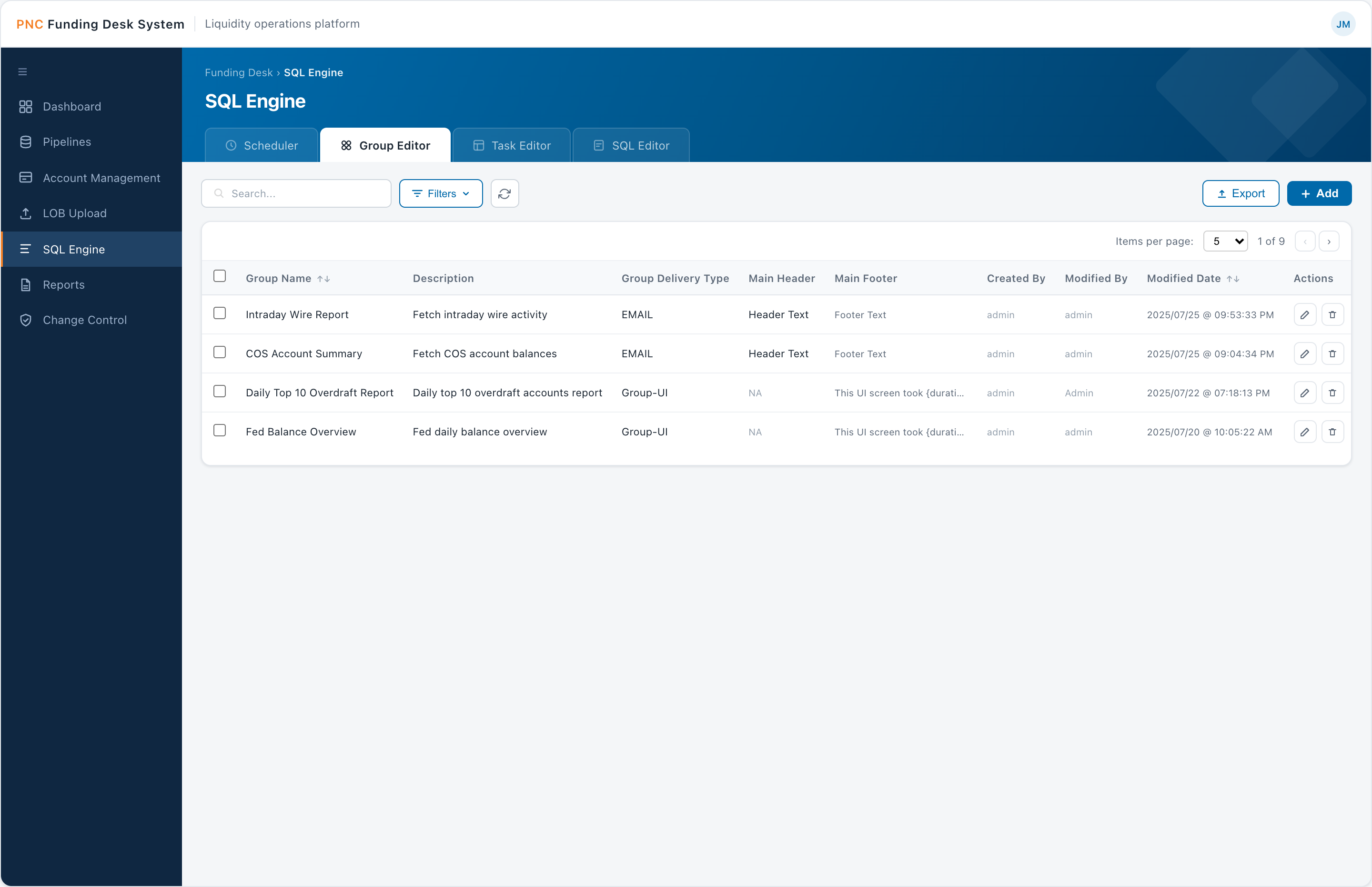
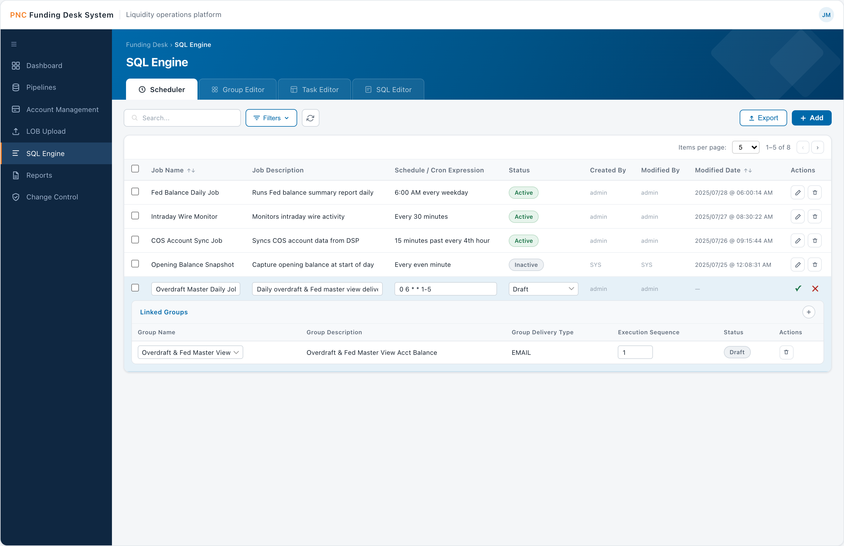
Why: separating authoring, packaging, bundling, and timing lets one query power many scheduled, formatted deliveries.
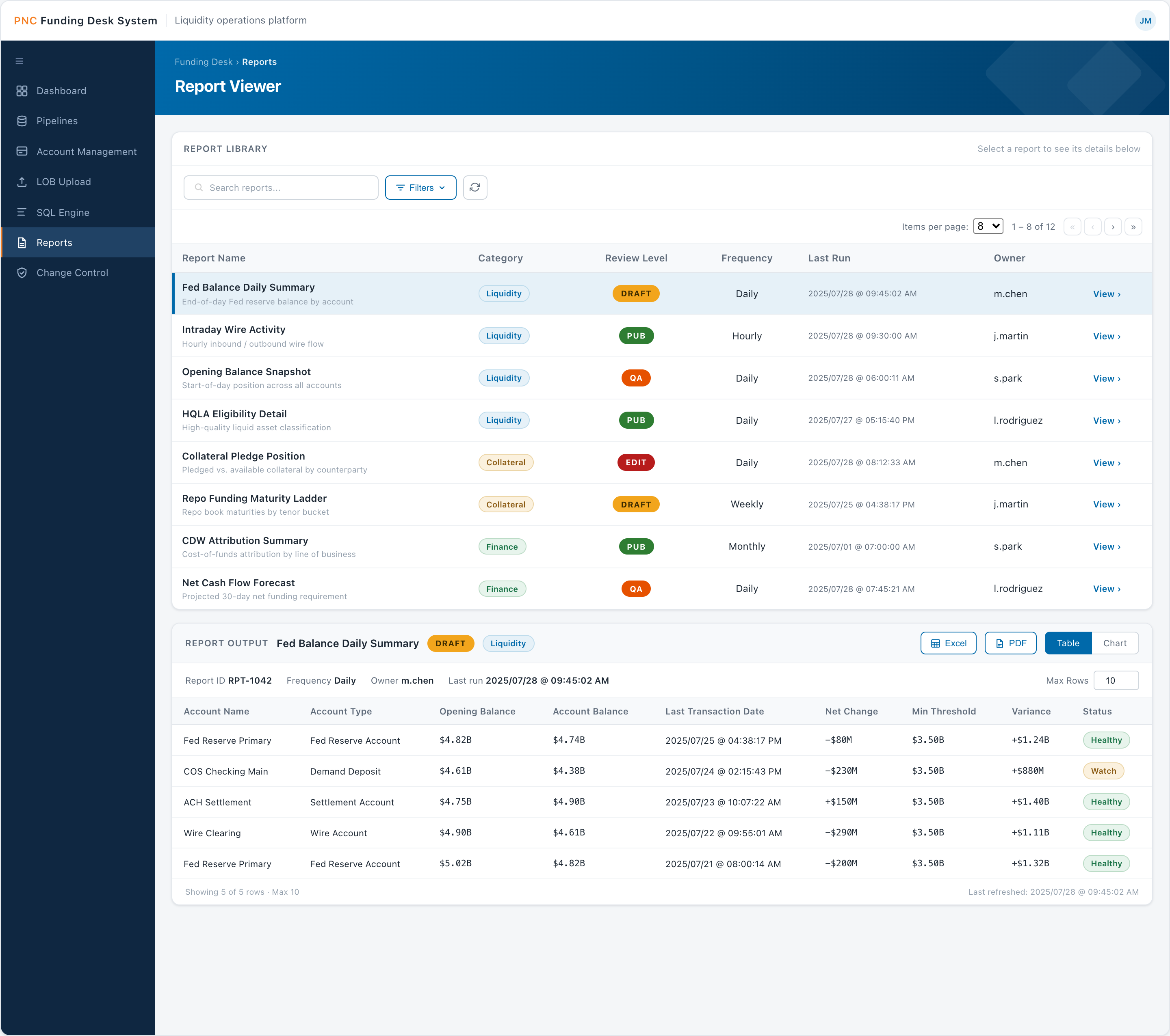
10 Deliver
Report Viewer
Where reports are consumed: pick a report, set parameters, and read it as a table or a chart. It pairs with threshold-based email alerts that deep-link back into the data.
- Report selector and filter panel (date, min balance, state, account)
- Table / chart toggle, account-health pills, export to XLS / PDF
- Workflow states — Edit / Draft / QA / Pub
Why: serves both audiences — analysts read the table, business users read the chart — and keeps alerts actionable.
Design Challenges
Designing under constraint
No direct user access
The primary stakeholder — the Funding Desk manager — was senior, busy, and available only occasionally. Most day-to-day collaboration was with the software architect and engineering team, so I had to extract UX signal from technical conversations, read between the lines of requirements, and make defensible decisions without continuous user validation.
My approach was to treat every stakeholder review as high-stakes. When I did get in front of the team, I came with structured prototypes and specific questions — not open-ended feedback requests — because their time was too limited for abstract discussion. I prioritized showing over telling.
Designing for a split audience
The user base wasn't uniform. Analysts needed direct, powerful access to data — SQL queries, raw result sets, pipeline controls. Business-side users needed visibility into the same information without any technical fluency required.
The solution was a personalized, configurable dashboard layer that sat above the technical tooling and served everyone. Each user could build multiple dashboards for different purposes — an analyst tracking Fed balance movements on one and pipeline run statuses on another; a business manager viewing high-level balance summaries and alert history, no SQL required.
Time-sensitive, high-stakes workflows
Every decision had to account for the cost of a mistake. Threshold alerts needed to be actionable immediately — which is why notifications included a direct deep-link into the SQL Viewer rather than just a summary. The user shouldn't have to navigate to find the data; the alert takes them there.
Configurable refresh intervals (5 to 60 minutes) gave analysts control over data cadence without an engineering ticket. Small decisions like this reduced operational friction significantly.
Fitting UX into an engineering-led team
The team's primary language was technical. I learned to frame design decisions in terms engineers and architects understood — data flow, state, edge cases — rather than leading with visual or experiential language. Prototypes served as a shared contract between design and development, reducing ambiguity during build.
Outcomes
What changed
The tool launched and was adopted by the Funding Desk team. The transition away from manual Excel processes was the most visible win — hours of daily data gathering, reconciliation, and monitoring were replaced by automated ingestion, configured dashboards, and real-time alerts.
Feedback centered on two things: the automation of data intake and the quality of the updated reports. Both were direct replacements for work that had previously been done by hand, under time pressure, with room for error.
The broader impact was operational: a team that had been stitching together a picture of the bank's liquidity from spreadsheets and emails now had a single platform built around how they actually work.
Reflection
What I took away
This project pushed me into territory UX designers don't always encounter — deeply technical, regulated, data-dense, with limited user access and an engineering-led team.
Designing defensibly. I learned to make decisions I could explain clearly, prototype at the right fidelity for the right audience, and find UX opportunities inside technical requirements.
Owning the full picture. Working as the sole designer meant owning everything from information architecture down to interaction details — which sharpened my ability to prioritize and communicate design intent.
Speaking the team's language. Framing design in terms of data flow, state, and edge cases turned prototypes into a shared contract between design and development, reducing ambiguity during the build.
Next project
Skyline Physicians →